- ConversionMail
- Posts
- The PDP question every shopper asks in 7 seconds
The PDP question every shopper asks in 7 seconds
Plus: 5 changes, zero redesign, and a result most brands never see
Oliver Kenyon
April 08, 2026
Hey optimizer!
Tune in to ConversionMail, where we compose conversion symphonies that'll make your customers sing 🎵
P.S. Quick heads up before we dive in. This week's newsletter is packed with visual examples and CRO tricks that really need to be seen to make sense.
If your email service provider isn't displaying the images properly (or at all), don't worry, I've got you covered. Just click the link in the top right corner to read the full version online where everything will show up perfectly.
Highlights of Today’s Newsletter
High Converting Design Inspiration: Why your mobile menu is bleeding revenue
A/B Test Of The Week: This menu tweak added $92k in 31 days
Weekly Content Roundup
Get the latest and greatest CRO content from around the web.
The team producing PDPs that have every conversion element dialled in (Link)
Damn this design is so clean.....🧹 (Link)
Shopify: How can an AI recommendation system increase sales? (Link)
Client’s Results
Still my favourite thing to share on social media...

High Converting Design Inspiration
After working with 4,000+ ecom brands, here's what I'd test first if I was brought in to optimise Cool Crutches.
(For context: I don't work with them and don't have access to their data, which is critical at this level but from a heuristic UX/UI standpoint, here's where I'd start.)
1️⃣ Homepage: Shift From Product → Outcome

Before:
Product heavy visuals
Generic "new to sale" messaging
Weak emotional connection
After:
Clear outcome led headline: feel like yourself again
Benefits reframed around real life impact (confidence, comfort, movement)
Strong supporting proof (20,000+ customers + press logos)
Clear, focused CTA: shop the collection
CRO principle: People don't buy products. They buy how it makes them feel.
2️⃣ PDP: Make Value Instantly Clear
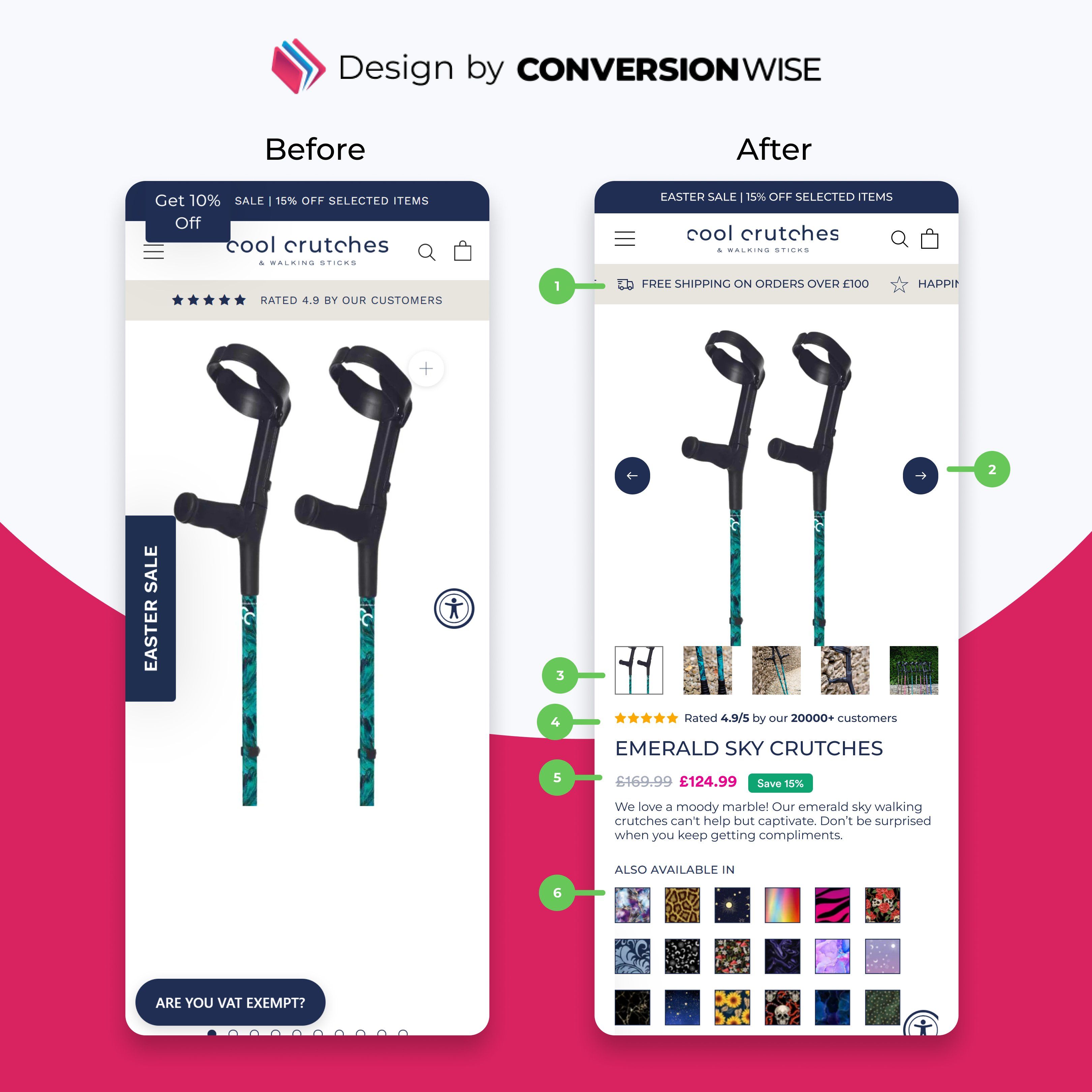
Before:
Product visible, but little persuasion
Minimal hierarchy around reviews + benefits
Variants feel secondary
After:
Strong social proof anchored under the gallery
Clear pricing with savings highlighted
Benefit led description (comfort, compliments, usability)
Visual variant grid making exploration easy
CRO principle: Answer "why this?" in seconds.
3️⃣ Cart: Guide The Final Decision

Before:
Weak structure to upsells
CTA competing with secondary actions
Little reinforcement of value
After:
Progress bar introduces momentum (free gift threshold)
Clean, high converting cross sells with ratings
Savings clearly surfaced
Strong, dominant checkout CTA with trust badges
CRO principle: Remove friction at the moment of intent.
This isn't about redesigning pages.
It's about:
Reframing the value
Guiding decisions
Increasing confidence at every step
That's what actually drives conversion rate and AOV.
A/B Test Of The Week

Your mobile menu is probably costing you more revenue than your ads.
And the worst part? You're not even measuring it.
We made a few simple changes to a brand's menu and generated:
👉 +$92,000 per month
No redesign. No new products. Just fixing how users navigate.
🧪 The Problem
Most mobile menus are built like this:
Endless dropdowns
Low priority links everywhere
No clear direction
No focus on revenue driving actions
It becomes a scrolling exercise, not a buying journey.
Here's what we changed:
1️⃣ Added A Search Bar At The Very Top
Search users convert the highest. So we made it impossible to miss.
2️⃣ Made "Clearance Sale" The Hero Item (With 60% OFF)
Not hidden. Not buried. Front and centre.
High intent + urgency = clicks.
3️⃣ Removed Dropdown Friction
Collapsed menus slow users down. We made key paths one tap away.
4️⃣ Added A Testimonial Inside The Menu
Sounds small. But this reinforces trust before they even browse.
5️⃣ Cleaned Everything Else Up
Less noise. More focus. Better decisions.
Why It Worked
Menus aren't navigation… They're decision making environments.
If you remove friction + guide attention → users move faster → revenue goes up.
The Result
👉 +$92,000/month
From a menu most brands ignore.
Takeaway
If your menu:
Feels cluttered
Has no clear priority
Doesn't guide users toward revenue
You don't have a navigation problem. You have a conversion problem.
Fix your menu.
What do you want to learn next Wednesday?Vote below and your wish will come true: |
🚀 Want to Reach 40,465+ E-commerce Store Owners?
ConversionMail connects your brand with a highly engaged audience of store owners, marketers, and optimization specialists who are actively looking for solutions to boost their bottom line.
From CRO platforms and analytics tools to email solutions and checkout optimizers, if your product helps online stores make more money, our audience wants to know about it.
What did you think of this week's issue?We take your feedback seriously. |