- ConversionMail
- Posts
- Stop obsessing over your product page
Stop obsessing over your product page
Plus: The AIDA model is dead. What's replacing it converts much better
Oliver Kenyon
February 25, 2026
Hey optimizer!
If your conversion funnel was a water slide, would visitors be screaming with joy or scrambling for the exit? Let's add some slip to your slide in today's edition
P.S. Quick heads up before we dive in. This week's newsletter is packed with visual examples and CRO tricks that really need to be seen to make sense.
If your email service provider isn't displaying the images properly (or at all), don't worry, I've got you covered. Just click the link in the top right corner to read the full version online where everything will show up perfectly.
Highlights of Today’s Newsletter
High Converting Design Inspiration: Offers are what scale brands. Not colours. Not prettier buttons
A/B Test Of The Week: Most brands obsess over their product page.
We increased revenue by optimising the cart
Your Vote, Your Content: Your customers shouldn't need to zoom in to buy from you
Weekly Content Roundup
Get the latest and greatest CRO content from around the web.
Your Vote, Your Content!
Last week you voted, and the results are in! Here's what you chose for this week's deep dive
Your Customers Shouldn't Need to Zoom In to Buy From You
Here's what most brands get wrong on their product pages:
They use tiny, lightweight fonts.
They hide social proof below the fold.
They lead with basic product titles.
Working with hundreds of ecom brands at ConversionWise, we've found a better approach.
What's it going to be for next week? Vote now and decide what we cover!
What do you want to learn next Wednesday?Vote below and your wish will come true: |
R.I.P the AIDA model for your landing pages.
We rebuilt it into ATIDCOA.
It converts way harder (Link)
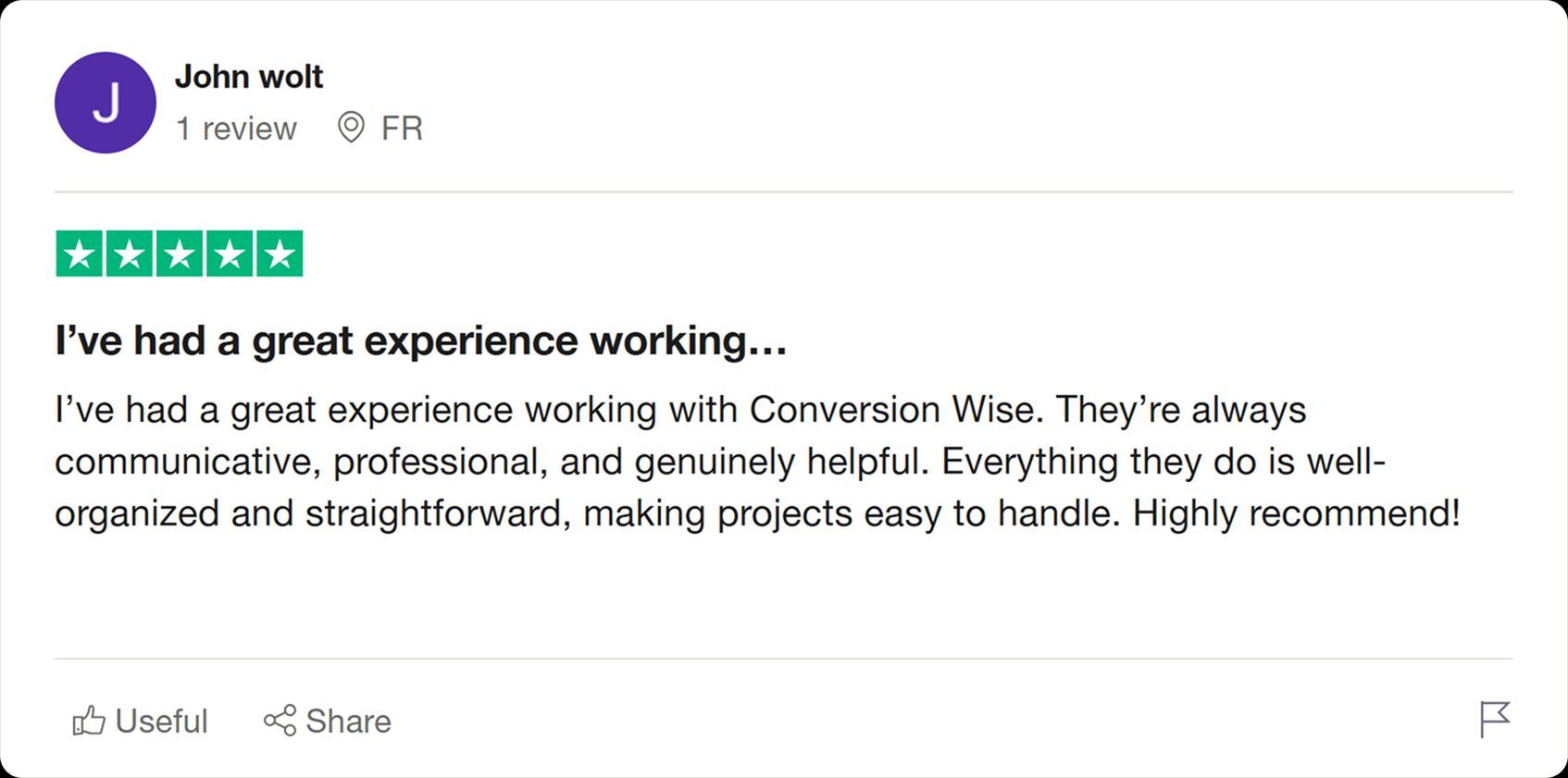
Client’s Results
Professional, communicative, and organized.
That’s what makes working with ConversionWise effortless 💯
High Converting Design Inspiration

Offers are what scale brands.
Not colours.
Not prettier buttons.
Not marginal UX tweaks.
Offers.
When we designs this page we didn’t reinvent the product.
We amplified the value.
– 50% off anchored against full price
– 5 free gifts stacked visually
– Free shipping
– Clear total savings callout
– Risk-free 365-day guarantee
– Low stock + shipping deadline
Same fountain.
Different perceived value.
When the offer is undeniable, conversion gets easier.
When conversion gets easier, scale gets cheaper.
Traffic amplifies whatever you’ve built.
If your offer is weak → you pay for it in CAC.
If your offer is strong → ads become fuel.
The brands that grow fastest don’t just optimise pages.
They engineer irresistible offers.
🌹 Possibly my favourite hero shot we’ve created for a client this Valentine’s

A few recent hero designs from the team 🧑🍳💋

A/B Test Of The Week

Most brands obsess over their product page.
We increased revenue by +$21,516 per month…
by optimising the cart.
The Context:
This store was already doing ~$150K/month.
Solid traffic. Solid offer. Solid brand.
But the cart experience was passive.
It wasn’t reinforcing the buying decision.
Phase 1 – UX Upgrade
We improved the cart slider to create a more dynamic, seamless experience.
Cleaner layout.
Better hierarchy.
Clear free-shipping progress visibility.
Small friction removed.
Phase 2 – Conversion Reinforcement
Using post-purchase survey data, we surfaced the 4 biggest buying drivers directly inside the cart:
True to Size
All-Day Comfort
Easy Exchanges & Returns
Premium Quality
We placed these directly beneath the CTA.
Right at the moment of hesitation.
Why It Worked:
The cart is where doubt creeps in.
Instead of adding more steps, we added reassurance — without requiring extra clicks.
No new pages.
No aggressive upsells.
Just reinforcing why the customer should complete the purchase.
The Result:
👉 +$21,516 per month
A 14.3% increase in revenue from one focused cart optimisation.
Reminder:
CRO isn’t just about getting people to the cart.
It’s about making sure they don’t leave it.
🚀 Want to Reach 40,465+ E-commerce Store Owners?
ConversionMail connects your brand with a highly engaged audience of store owners, marketers, and optimization specialists who are actively looking for solutions to boost their bottom line.
From CRO platforms and analytics tools to email solutions and checkout optimizers, if your product helps online stores make more money, our audience wants to know about it.
What did you think of this week's issue?We take your feedback seriously. |