- ConversionMail
- Posts
- Clean design killed our conversions
Clean design killed our conversions
Plus: This layout framework turns mobile browsers into instant buyers
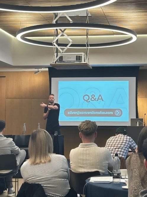
Oliver Kenyon
July 16, 2025
Hey optimizer!
ConversionMail dropping in your inbox right on schedule! We've got some handy insights that have been floating around our team lately.
Let's see what clicks with you
Highlights of Today’s Newsletter
A/B Test: Your homepage hero is your first shot at conversion. Mess it up, and the rest of the page doesn’t matter
The Chosen Topic: Good design doesn’t always convert. This 5-step product page framework shows what actually works.
CRO Insight: “Make it clean” is the fastest way to kill conversions
Video: Sales-Driving tweaks you’re likely ignoring on key pages
Weekly Content Roundup
Get the latest and greatest CRO content from around the web.
Design 🎨
If your mobile page can’t sell in 5 seconds,
you’ve already lost the sale.
This layout fixes that.
Save it. Screenshot it. Steal it. (Link)
Enterprise brands don’t scale with design trends. Use this framework before your next CRO sprint (Link)
CRO Around the Web 🌐
Shopify: Buyer Journey Guide: How To Design an Effective Buyer Journey (Source)
Baymard: Small Catalog DTC: New UX Benchmark with 2,500+ Performance Scores and 1,700+ Best Practice Examples (Source)
Academy 🎓️
New Custom Audits For Our Conversion Rate Academy Members: 🏋️ Gym Memberships, Plants Delivery (Link)
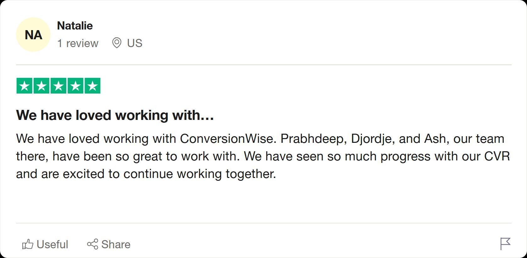
Client’s Results
Great partnerships drive great results - that's the CRO formula 🚀
Video Of The Week
In this OBO episode, I break down how Olipop - a well-optimized DTC brand - could drive even more revenue with a few smart UX tweaks.
No data, no analytics - just a straight UX/UI audit built on 12 years of CRO experience across 3,500+ ecom stores
High-Converting Design Inspiration
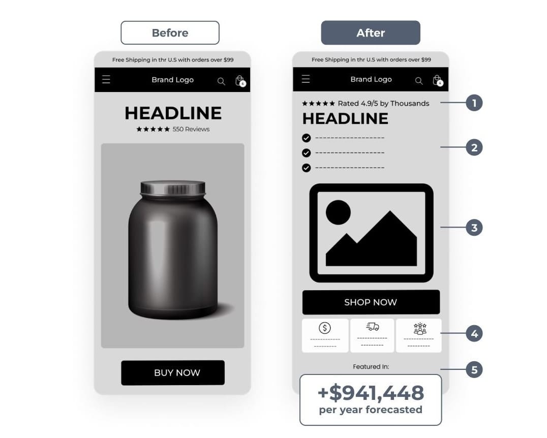
Your homepage hero is your first shot at conversion.
Mess it up, and the rest of the page doesn’t matter.
We ran a simple hero redesign test for a brand that had decent traffic, but weak clarity above the fold.
No layout overhaul. No new offer.
Just sharper messaging and trust signals up top.
Here’s what we changed:
- High-quality imagery to frame the offer visually
- “Rated 4.9/5 by Thousands” for instant credibility
- Recognition logos to boost trust on first glance
- Clearer headline that explains the product, who it’s for, and why it’s different
The result?
✅ +$78,454/month
✅ +$941,448/year (forecasted)
✅ +$1.54 revenue per session
When you get specific, users get confident.
When you earn trust fast, you earn clicks faster.
Most homepage heroes try to look good.
The best ones convert.
CRO Insight
“Make it clean” is the fastest way to kill conversions.
Brands chase minimalism because it feels premium.
Big hero image? No text.
Product gallery? No context.
Whitespace everywhere? Looks “elevated.”
But here’s the problem:
Minimal doesn’t mean usable.
We’ve seen it too many times:
Gorgeous redesigns.
No headlines, no benefits, no direction.
And a sharp drop in RPS right after launch.
The truth?
– Pretty doesn’t persuade.
– Minimal doesn’t mean modern.
– And clean design won’t sell what copy can’t explain.
The best-performing sites we touch?
They look good, but they communicate better.
Every section earns its place:
→ Headlines that lead.
→ Buttons with purpose.
→ Images that show value, not just vibe.
That’s what separates high-performing from high-concept.
So no, clean isn’t the problem.
But silent pages? Absolutely are.
Design should drive action.
Not just admiration.
Good Design Doesn’t Always Convert. This 5-step Product Page Framework Shows What Actually Works.
If you want to design product pages that convert like the biggest DTC brands, you need a framework.
Step 1: Above The Fold
1:1 ratio product images
Clear, benefit driven headline
Price prominently displayed
Star rating + review count
Add to Cart button visible
Step 2: Structure Your Layout
Break your page into four key sections:
Hero
Product showcase & key benefits
Details
Features & specifications
Social
Reviews & user content
Support
FAQs & shipping info
Step 3: Design Elements
Follow these proven principles:
Whitespace: Create breathing room
Hierarchy: Guide the eye naturally
Contrast: Make CTAs pop
Typography: Use max 2 to 3 fonts
Colors: Stick to brand palette + accent
Strategic positioning is crucial:
Reviews summary above the fold
Photo reviews below product images
Trust badges near Add to Cart
UGC gallery mid page
Customer testimonials throughout
Step 5: Visual Hierarchy
Make key elements stand out:
Product images (largest)
Price point (prominent)
Add to Cart (contrasting)
Benefits (scannable)
Shipping info (clear but subtle)
Remember: The best product pages aren't just beautiful — they're strategic conversion machines.
🚀 Want to Reach 40,465+ E-commerce Store Owners?
ConversionMail connects your brand with a highly engaged audience of store owners, marketers, and optimization specialists who are actively looking for solutions to boost their bottom line.
From CRO platforms and analytics tools to email solutions and checkout optimizers, if your product helps online stores make more money, our audience wants to know about it.
What do you want to learn next Wednesday?Vote below and your wish will come true: |
|
What did you think of this week's issue?We take your feedback seriously. |