- ConversionMail
- Posts
- Big uplift from a simple UX/UI change
Big uplift from a simple UX/UI change
Plus: These friction-revealing questions beat "rate your experience"
Hey optimizer!
ConversionMail is back with some fresh perspectives on making your site work better.
Grab a snack and let's explore what we've discovered lately.
P.S. Quick heads up before we dive in. This week's newsletter is packed with visual examples and CRO tricks that really need to be seen to make sense.
If your email service provider isn't displaying the images properly (or at all), don't worry, I've got you covered. Just click the link in the top right corner to read the full version online where everything will show up perfectly.
Highlights of Today’s Newsletter
A/B Test: Big uplift from a simple UX/UI change
The Chosen Topic: Asking the right post-purchase questions is one of the simplest ways to improve conversions
CRO Insight: Luxury brand. Non-luxury UX
Video: Inside the $140M Ecommerce Test Vault (Revealed for the First Time)
Weekly Content Roundup
Get the latest and greatest CRO content from around the web.
Design 🎨
15 high-converting landing page examples from the No.1 landing page agency on the planet (Link)
10 silent conversion killers on your site (Link)
CRO Around the Web 🌐
Shopify: Best Marketing Attribution Tools For Small Businesses (Source)
Baymard: Checkout UX 2025: 10 Pitfalls and Best Practices (Source)
Most Conversion-Optimized Shopify Theme Ever ⚡
Join the waiting list to secure your chance: spots are prioritized in order of sign-up: https://surgetheme.com/
Client’s Results
Thoughtful analysis before action - that's how real solutions take shape.
We may not be magicians, but our concrete solutions do make metrics move.
Thank you Kavita for trusting us with your growth story - here's to the measurable "magic" ahead 💎

High Converting Design Inspiration

Luxury brand. Non-luxury UX.
NEST has incredible products and world-class brand equity but their site is missing core persuasion levers 👇
Here’s how I’d optimize their store after 12+ years improving 3,500+ ecommerce brands:
1/ Homepage Above-The-Fold
→ Clear, high-contrast reassurance bar (“FREE Shipping for orders over $125”)
→ Added trust icons for credibility (Easy Return, Super Fast Delivery, Quality You Trust)
→ Stronger navigation shortcuts (Candles, Perfumes, Diffusers, Bath & Body, Gifts)
→ Added review score (4.7/5 by 3,000+ customers) for instant social proof
→ Benefit-driven headline: Where Luxury Meets Every Moment
→ Supporting bullets: Iconic scents, Everyday luxury, Elegant gifts
→ Strong CTA shift from generic to Shop Bestsellers
→ Introduced visual scroller for browsing key products
CRO Insight

Big uplift from a simple UX/UI change.
🧪 Recent winning test!
The Test:
Realigning product cards on the collection page.
The Goal:
To improve clarity, increase PDP (Product Detail Page) views, and ultimately drive higher conversion rates and revenue per visitor.
The Why:
When product cards are cluttered or inconsistent, users have to work harder to process what they’re seeing.
We hypothesized that by aligning key elements (titles, pricing, labels, and CTAs) and emphasizing the product flavours, we’d reduce cognitive load and make browsing effortless, leading to more clicks and deeper engagement.
The What:
1. Standardized spacing and hierarchy across product cards.
2. Improved readability and visual balance.
3. Highlighted flavour names to make choices easier at a glance.
Asking the Right Post-Purchase Questions is One of the Simplest Ways to Improve Conversions

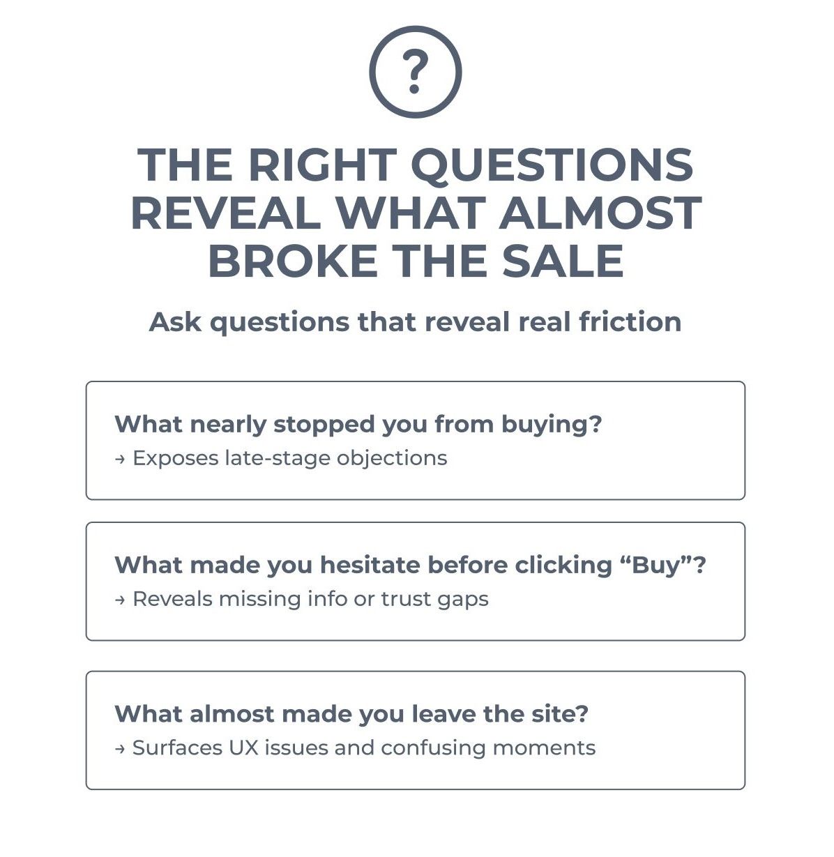
Asking the right post-purchase questions is one of the simplest ways to improve conversions.
But most brands still ask: “How was your experience?”
Which usually leads to vague answers like “fine” or “easy.”
If you want insights that actually help you improve your site,
ask questions that reveal friction:
- What nearly stopped you from buying?
- What made you hesitate before clicking ‘Buy’?
- What almost made you leave the site?
These questions go beyond surface feedback.
They show you:
- Where trust breaks down
- Where clarity is missing
- What’s slowing people down right before they convert
We’ve used this exact approach to surface objections, then fix them with targeted reviews and trust elements.
🚀 Want to Reach 40,465+ E-commerce Store Owners?
ConversionMail connects your brand with a highly engaged audience of store owners, marketers, and optimization specialists who are actively looking for solutions to boost their bottom line.
From CRO platforms and analytics tools to email solutions and checkout optimizers, if your product helps online stores make more money, our audience wants to know about it.
What do you want to learn next Wednesday?Vote below and your wish will come true: |
What did you think of this week's issue?We take your feedback seriously. |