- ConversionMail
- Posts
- 🔄 Above-fold redesign nets 💲324K/year
🔄 Above-fold redesign nets 💲324K/year
Plus: Learn why banners are killing your product discovery
Hey optimizer!
Ready to transform your conversion rates?
This week's newsletter is packed with practical CRO insights, testing strategies, and optimization techniques you can implement right away. Time to level up your CRO game!
Highlights of Today’s Newsletter
Design: Simple website changes that can boost conversions instantly
The Chosen Topic: One simple above the fold redesign added $324k in yearly revenue
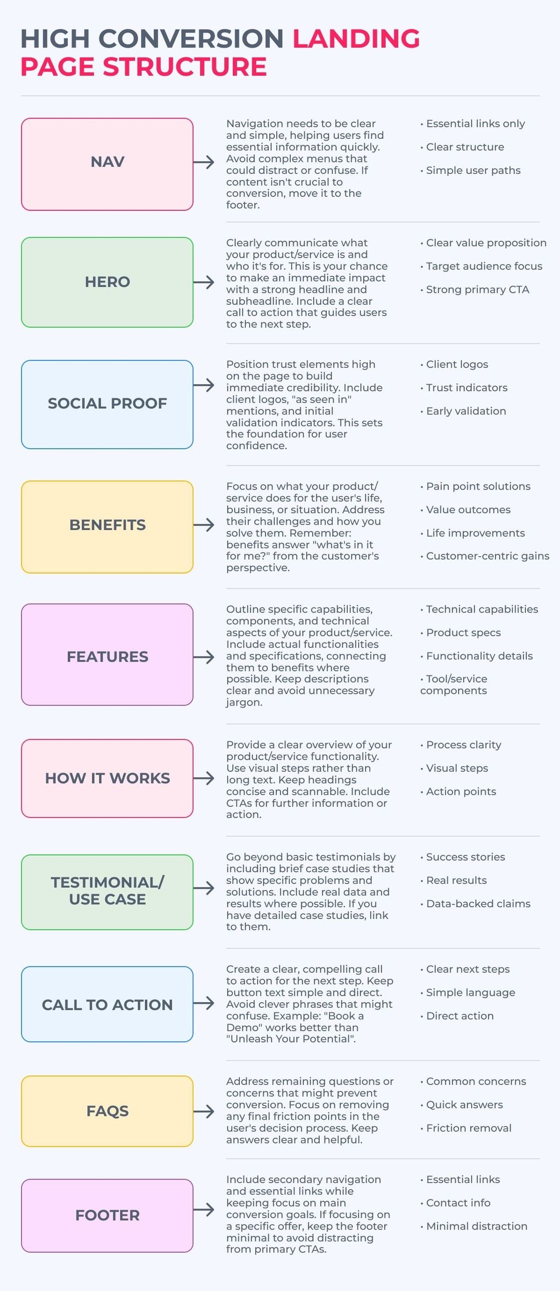
CRO Insight: High-converting landing page structure
Video: How focusing solely on conversion rates can actually mislead you
Weekly Content Roundup
Get the latest and greatest CRO content from around the web.
Design 🎨
Simple website changes that can boost conversions instantly (Link)
A/B testing vs split testing - which is right for your website? (Link)
5 simple page tweaks to boost sales by 10X! (Link)
CRO Around the Web 🌐
Shopify: How To Craft a Visual Marketing Strategy That Sells (Source)
Baymard: Retain Data in Sensitive Credit Card Fields after Validation Errors (34% Don’t) (Source)
Academy 🎓️
The New Audits for Our Members Are In: 😴 Sleep Consulting, Personal Injury, Dropshipping, Pain Relief (Link)
Upcoming Events

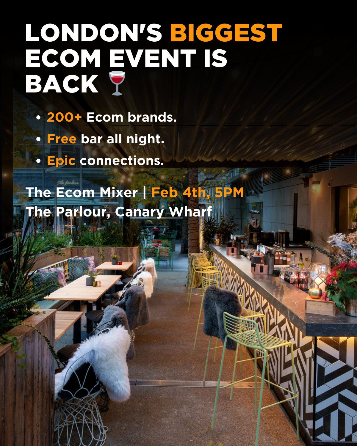
London's Biggest Ecom Meetup Is Back
(And it's completely free)
200+ ecom brands
One room
Unlimited opportunities
📅 When:
February 4th, 2025
5PM onwards
📍 Where:
The Parlour, Canary Wharf
London's most iconic networking venue
What to expect:
🍸 Free bar all night
🤝 Curated ecom connections
💼 Industry-leading founders
📝 New partnership opportunities
🎵 Live music & entertainment
Limited spots available.
First come, first served.
Video Of The Week
I recently had the pleasure of joining Kurt Elster on The Unofficial Shopify Podcast dropping some absolute gold about what REALLY matters in CRO:
Why the "best practices" debate in CRO isn't as black and white as most people think
How focusing solely on conversion rates can actually mislead you (and what you should measure instead)
The real reason most store redesigns fail
A few unexpected insights from analyzing thousands of customer surveys
Really enjoyed breaking down these concepts and sharing some of our learnings from working with different brands. If you're curious about the technical side of CRO and what actually moves the needle, give it a listen.
High Converting Design Inspiration

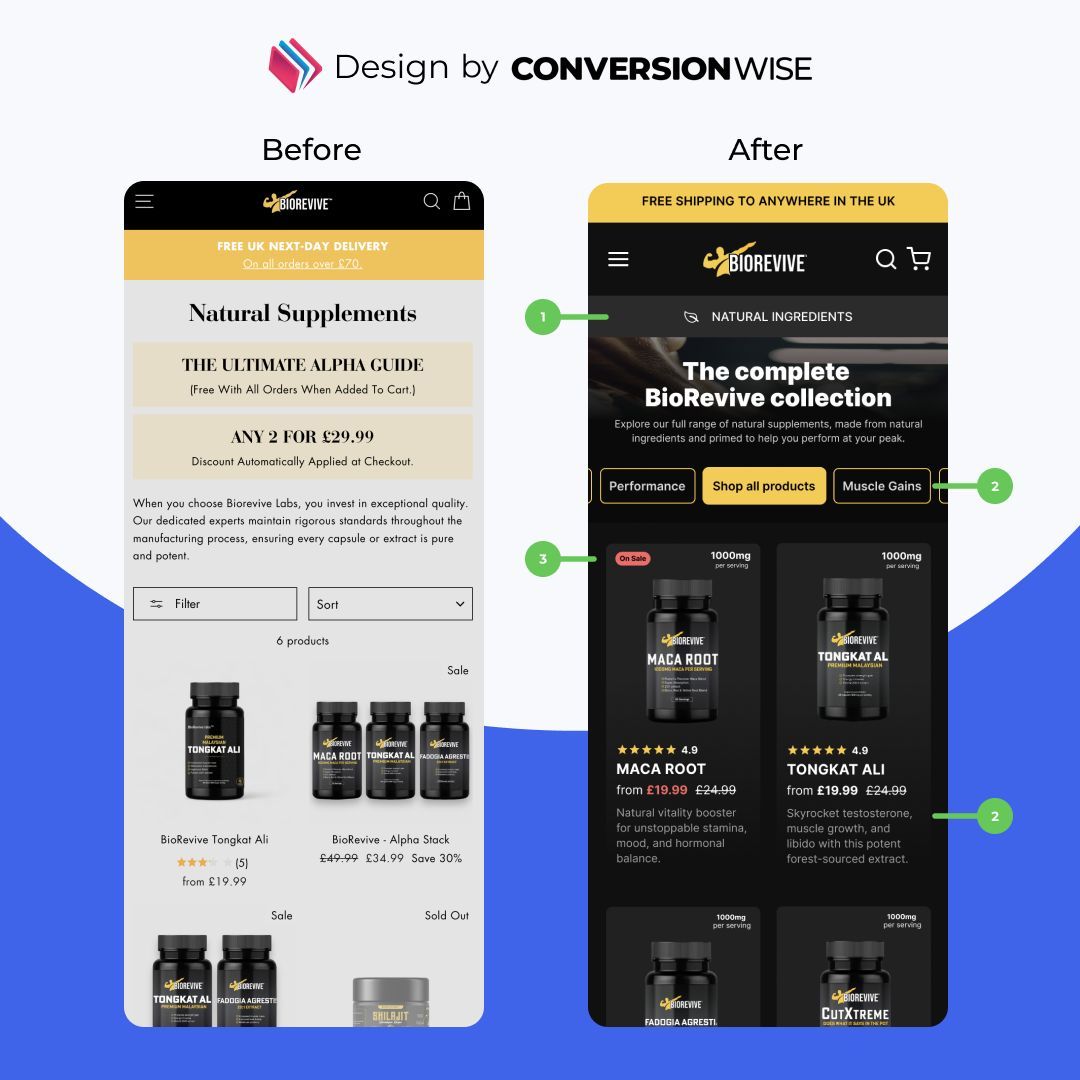
Collection Page Transformation
(How We Boosted Product Discovery) 🚀
Here's exactly what we optimized:
❌ The Problem:
Collection pages often go under-optimized, with brands missing key opportunities to showcase their products effectively.
Most brands get this wrong...
They add massive banners and descriptions that push products below the fold, creating unnecessary friction.
We took a different approach.
✔️ The Changes:
1. Enhanced Above-Fold Experience
→ Clear "Shop all products" CTA
→ Simplified collection navigation
→ Reduced unnecessary padding
2. Optimized Product Grid
→ Better product visualization with dark theme
→ Prominent titles and pricing
→ Strategic spacing between products
3. Enhanced Product Cards
→ Added customer ratings and reviews
→ Clear product descriptions
→ Better differentiation between similar items
But here's what most people miss:
Collection pages have TWO core objectives:
1. Show your products
2. Let people filter/sort them
Everything else is secondary.
📌 Key Insights:
- Sort collections by highest revenue per session
- Add descriptive text for similar-looking products
- Use strategic labeling (bestsellers, trending, new)
- Optimize for quick scanning and easy filtering
👉 The Lesson:
Your collection page isn't meant for massive banners or lengthy descriptions.
Its primary job is showing products quickly and making them easy to filter.
What unnecessary elements are hiding your products below the fold?
CRO Insight
Here's a high conversion landing page structure

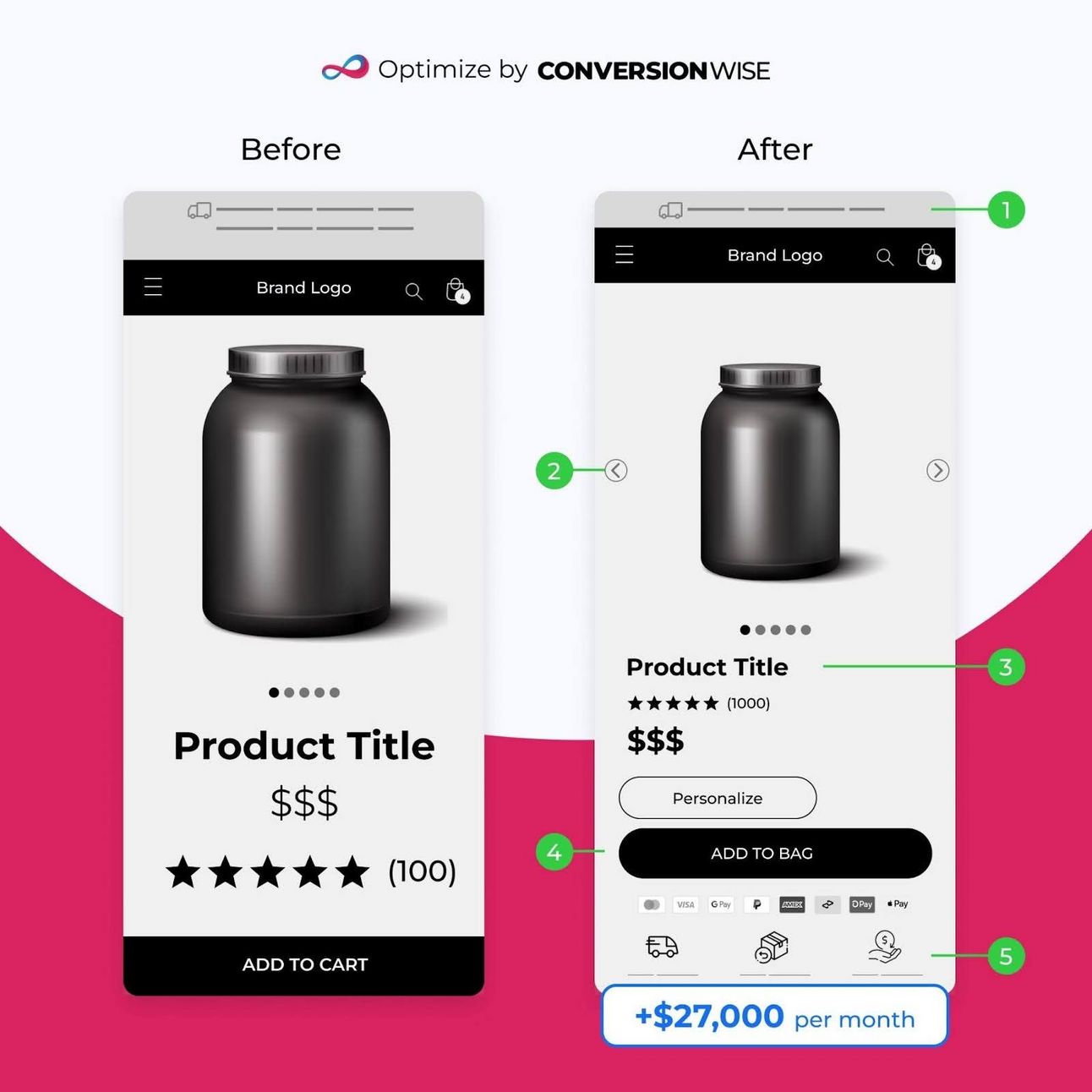
One Simple Above-the-Fold Redesign Added $324K in Yearly Revenue

Here's exactly what we changed:
The Problem:
Product pages weren't converting as well as they should. The crucial above-the-fold area wasn't doing its job.
Most brands get this wrong. They stuff everything above the fold, creating confusion and friction.
We took a different approach.
The Changes:
→ Simplified the layout
→ Enhanced product imagery
→ Streamlined value proposition
→ Removed distracting elements
→ Made the CTA impossible to miss
But here's what most people miss:
It's not about adding more elements. It's about removing anything that doesn't directly contribute to the purchase decision.
The Results:
• +$27,000 per month
• +$324,000 per year (forecasted)
• +$0.10 revenue per session
Key Insight:
Your above-the-fold area has ONE job: Move visitors toward a purchase decision.
Everything else is noise.
The Lesson:
Sometimes the biggest wins come from simplifying, not adding.
What elements are creating unnecessary friction on your product pages?
What do you want to learn next Wednesday?Vote below and your wish will come true: |
What did you think of this week's issue?We take your feedback seriously. |