- ConversionMail
- Posts
- 5 PDP fixes that convert instantly
5 PDP fixes that convert instantly
Plus: No pricing changes, no new traffic needed. Just one smart design fix that added $27,000 monthly revenue to our client
Oliver Kenyon
July 23, 2025
Hey optimizer!
What's crackin'?
Time for your weekly conversion dose.
We've been testing some theories lately, and a few turned out pretty interesting. Let me share what's working.
Highlights of Today’s Newsletter
A/B Test: If your product page isn’t converting, start with the first thing customers see
The Chosen Topic: Users decide in seconds. Your fold needs to do more than look good
CRO Insight: In CRO, pricing isn’t just about margins, it’s about how users perceive value
Video: Best sellers, bold fonts & smart CTAs - homepage fixes that convert
Weekly Content Roundup
Get the latest and greatest CRO content from around the web.
Design 🎨
Social proof goes way beyond just reviews on a page, let me explain this in 60 seconds. (Link)
7 tips on how to make your homepage not just a door, but a grand entrance to your brand's world. (Link)
On-Going CRO ⚡️
My Biggest Ever Giveaway - Limited Time!
I'm opening up our CRO Test Vault to the public.
Over $10,000,000 in winning AB tests!
- Tests
- Designs
- Results
Get It Here (Link)
CRO Around the Web 🌐
Shopify: CRM vs. Marketing Automation: Differences + How To Use (Source)
Baymard: Pet food & care: New ux benchmark with 3,300+ performance scores and 2,700+ best practice examples (Source)
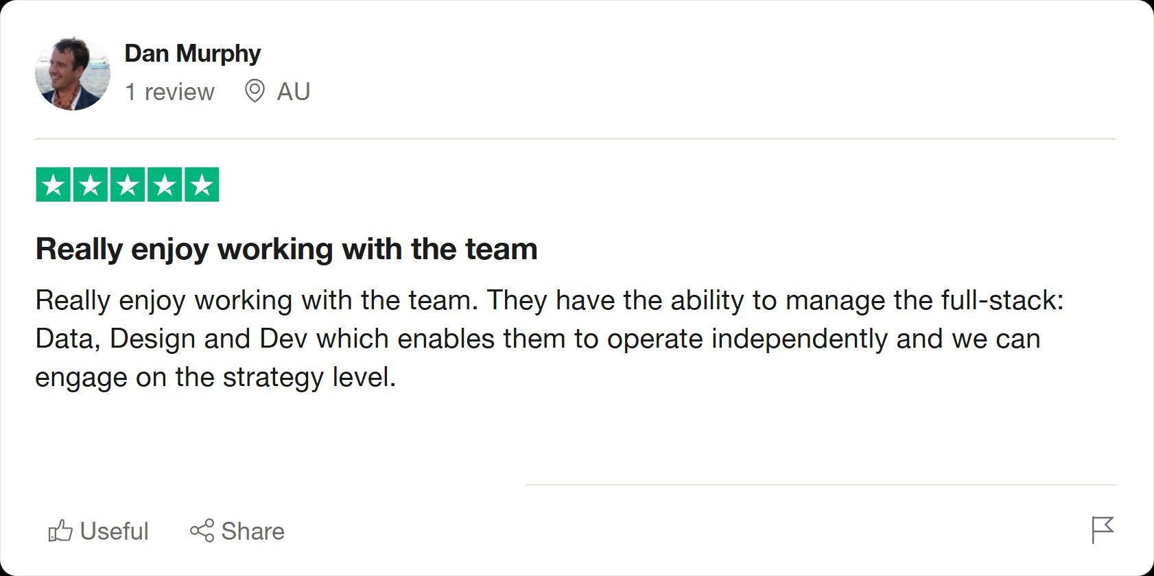
Client’s Results
Full-stack expertise means every detail is covered, end to end.
That's what lets us focus on what matters: your strategy 🚀
Video Of The Week
Best Sellers, Bold Fonts & Smart CTAs - Homepage Fixes That Convert
Here’s what you’ll learn:
✅ How a notice bar helps reinforce deals and drive clicks
✅ How a clear headline improves perceived value
✅ Why “Shop Best Sellers” reduces choice paralysis
✅ How press mentions boost trust and conversions
High-Converting Design Inspiration

If your product page isn’t converting, start with the first thing customers see.
We added $27,000/month by fixing the above-the-fold section - no pricing changes, no new traffic, just smarter design.
Here’s what we updated (and what you should check on your PDPs):
1/ Show shipping & delivery trust icons up top
Customers notice these first, don’t bury them.
2/ Make images swipeable
Shoppers want to explore the product before they scroll. Let them.
3/ Pull reviews higher on the page
Social proof shouldn’t be an afterthought. Lead with it.
4/ Simplify and strengthen your CTA
“Add to Bag,” clear payment options, and a friction-free layout matter more than clever copy.
5/ Add a benefit bar below the CTA
Reinforce value fast, think returns, guarantees, and shipping perks.
Small changes. Big lift.
Your above-the-fold section is the pitch. Make it count.
CRO Insight
In CRO, pricing isn’t just about margins, it’s about how users perceive value.

That’s why price testing is one of our 8 Big Swing strategies for brands under 300K sessions/month.
Here’s how to approach it:
✅ Test the structure, not just the number
→ $85 + gift vs $82 without
→ $50 vs $49
→ % off vs $ off
✅ Keep all other variables static
No copy changes. No design swaps. One change at a time.
✅ Track the right metrics
→ Conversion Rate
→ Revenue Per Session (RPS)
→ AOV
→ Drop-off at pricing steps
✅ Don’t assume
– Free = better
– Lower = cheaper perception
– Higher = more profitable
Sometimes, a cleaner price outperforms a complex offer, especially in price-sensitive markets.
Users Decide In Seconds. Your Fold Needs To Do More Than Look Good

The top of your product page isn’t just for branding.
It’s your first chance to build clarity, trust, and direction.
Here’s what to prioritize above the fold, and why:
1. Outcome-Focused Headline
State what the product does and who it’s for.
Lead with benefits, not product names.
2. Support Copy (Optional)
Add one line to clarify value or explain differentiation.
Keep it tight, and make it count.
3. High-Quality Product Image
Use a clear, mobile-optimized visual.
Ideally, in-use or lifestyle, not just a static pack shot.
4. Ratings and Reviews
Trust has to be visible immediately.
Show star ratings and review counts before the scroll.
5. Offer or Incentive Badge (Optional)
Mini callouts like “Free Shipping Over $75” or “Limited Offer” help nudge action.
Keep it subtle but above the fold.
6. Primary CTA Button
Make the action clear.
Use a single, high-contrast CTA like “Add to Cart,” and support it with copy: “Ships Free” or “30-Day Guarantee.”
7. Trust Icons (Optional)
Add payment logos or guarantee badges just beneath the CTA.
It’s a small cue, but it removes big hesitation.
Above the fold isn’t just where users land.
It’s where they choose whether to keep going.
Get it right, and every scroll becomes a step closer to purchase.
🚀 Want to Reach 40,465+ E-commerce Store Owners?
ConversionMail connects your brand with a highly engaged audience of store owners, marketers, and optimization specialists who are actively looking for solutions to boost their bottom line.
From CRO platforms and analytics tools to email solutions and checkout optimizers, if your product helps online stores make more money, our audience wants to know about it.
What do you want to learn next Wednesday?Vote below and your wish will come true: |
What did you think of this week's issue?We take your feedback seriously. |