- ConversionMail
- Posts
- 3 Pages silently killing your sales
3 Pages silently killing your sales
Plus: The shipping bar trick that makes customers add more items without feeling pushed
Oliver Kenyon
January 14, 2026
Hey optimizer!
ConversionMail has arrived, bringing you even more optimization hacks.
We're like steroids for your website, minus the unwanted side effects.
Let’s dive right in.
Highlights of Today’s Newsletter
Design: Premium skincare deserves premium clarity
The Chosen Topic: 7 high-impact CRO techniques that will instantly boost conversions
A/B Test: Menus don’t usually get the credit
Video: The 3 pages dragging down your conversions (and how to fix them)
Weekly Content Roundup
Get the latest and greatest CRO content from around the web.
Design 🎨
From Fortune 500 giants to niche industry leaders, we've helped countless companies boost their conversion rates.
It all starts with a scroll-stopping first impression (Link)
We boost our clients’ stores by MILLIONS of additional revenue.
5 phases of our CRO process you can implement for results (Link)
CRO Around the Web 🌐
Shopify: 2026 Ecommerce Trends: How Brands Are Planning Ahead (Source)
Baymard: Mobile UX Trends 2025: 9 Common Pitfalls & Best Practices (Source)
Client’s Results
First impressions turned into lasting partnerships 🤝
High Converting Design Inspiration
Premium skincare deserves premium clarity.
OSEA already has a beautiful brand, loyal customers, and strong products.
But the UX was making people work harder than they should 👇
Here’s how I’d optimize it.
1/ Cart: make free shipping do the heavy lifting

Before:
• Free shipping message easy to miss
• Progress unclear
• Upsells visually disconnected
After:
• Clear free-shipping bar with progress indicator
• Exact dollar amount called out (“You’re $12 away”)
• Cleaner product hierarchy
• Upsells reframed with reviews and strong “Add” CTAs
• Savings surfaced clearly instead of hidden
This alone can lift AOV meaningfully.
2/ PDP: move trust above persuasion

Before:
• Strong imagery, weak reassurance
• Reviews pushed too far down
• Benefits buried in paragraphs
After:
• Trust strip added immediately (Vegan, Cruelty-Free, Ocean-Powered)
• Review score pulled above the fold
• Benefits converted into scannable bullets
• Size selection simplified
• Subscription framed as value, not pressure
Result: less scrolling, faster decisions.
3/ Homepage: emotion + evidence

Before:
• Nice creative
• Vague value proposition
• Social proof came too late
After:
• Clear headline with emotional payoff
• Review score surfaced immediately
• Benefit icons added for quick scanning
• One dominant CTA instead of competing actions
• Visual content used to reinforce lifestyle, not distract
None of this changes the brand.
It just removes friction and lets the product win.
More Optimization by Oliver coming very soon
CRO Insight
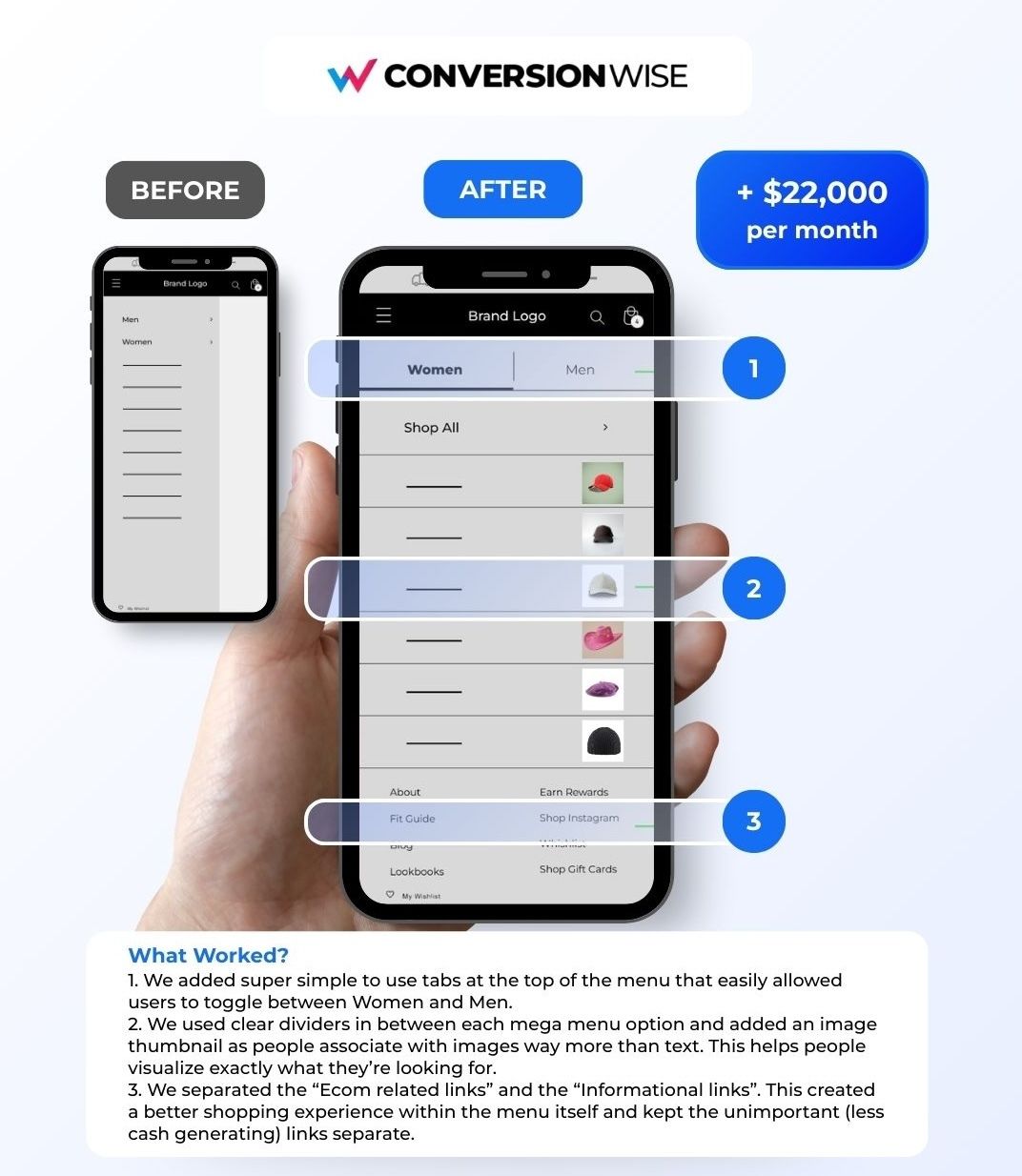
Menus don’t usually get the credit.
But this one simple mobile menu change unlocked +$22,000 per month.
The Test:
Redesigning the mobile mega menu to reduce friction and improve product discovery.
The Problem:
The original menu was text-heavy, hard to scan, and mixed high-intent shopping links with low-intent informational links.
On mobile, that creates hesitation and hesitation kills momentum.
What We Changed:
1. Added simple Women / Men tabs at the top to instantly reduce cognitive load.
2. Introduced clear dividers and image thumbnails so users could scan visually instead of reading.
3. Separated revenue-driving links from informational links, keeping shopping paths front and centre.
Why It Worked:
Users could orient themselves faster, find what they wanted with fewer decisions, and reach products quicker.
Less thinking. More buying.
The Result:
👉 +$22,000 per month (forecasted)
Driven by improved navigation flow, PDP views, and overall CVR.
I’ll keep sharing the wins, the losses, and the learnings from real CRO tests.
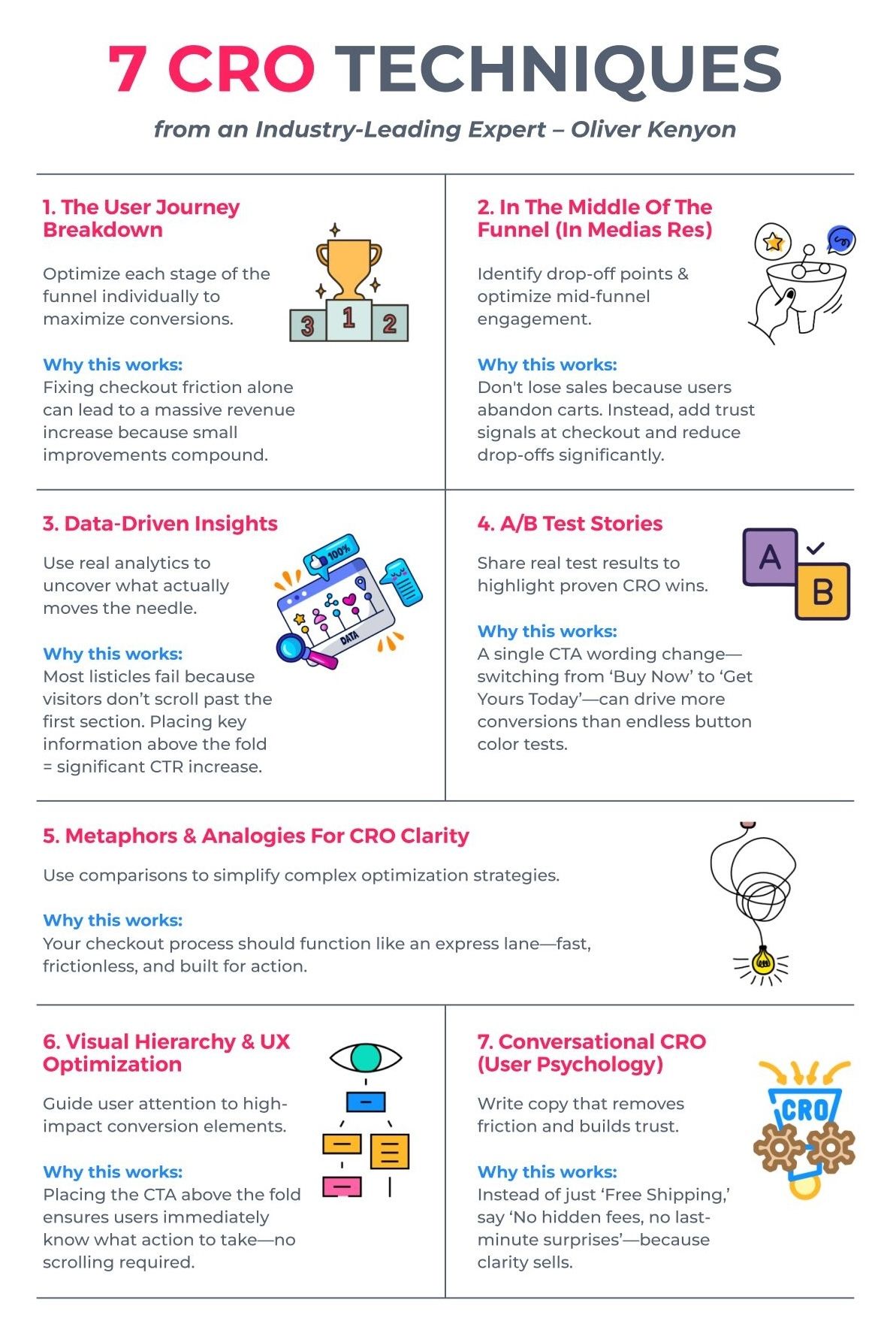
7 High-Impact CRO Techniques That Will Instantly Boost Conversions
🚀 Want to Reach 40,465+ E-commerce Store Owners?
ConversionMail connects your brand with a highly engaged audience of store owners, marketers, and optimization specialists who are actively looking for solutions to boost their bottom line.
From CRO platforms and analytics tools to email solutions and checkout optimizers, if your product helps online stores make more money, our audience wants to know about it.
What do you want to learn next Wednesday?Vote below and your wish will come true: |
What did you think of this week's issue?We take your feedback seriously. |