- ConversionMail
- Posts
- 12 conversion killers we see repeatedly
12 conversion killers we see repeatedly
Plus why removing friction beats adding features every time
Oliver Kenyon
November 26, 2025
Hey optimizer!
You know that feeling when you visit a website and everything just flows?
No friction, no confusion, just smooth sailing to checkout?
Let's break down how to create that experience for your visitors
Highlights of Today’s Newsletter
A/B Test: This one’s a perfect example of how removing friction, not adding features can lead to major gains
The Chosen Topic: If your landing page feels messy, you don’t need more design trends, you need structure
CRO Insight: Fable’s store looks great but it’s missing key conversion signals
Video: How we increased Shopify conversion rates by 30% in 3 minutes
Black Friday Blackout: 50% Off Landing Pages
Our Black Friday Landing Page Sale launched this week and we've had more purchases in the first few hours than we expected for the entire week.
Here's the deal: We might have to shut this sale down mid-week if the pace continues.
Why?
Because we refuse to overcommit and sacrifice the quality of work that's generated over $1 billion in revenue for our clients.
The pages everyone's grabbing right now are Sales Pages & Funnels, Product Pages (PDPs), Direct response lead/sales pages, and Offer pages for Q1/Q2 campaigns.
If you've been on the fence about getting high-converting pages designed for your brand, now's the time to lock it in before we hit capacity and turn off the sale.
Weekly Content Roundup
Get the latest and greatest CRO content from around the web.
Design 🎨
In 12+ years, our team of 50 CRO experts has optimized 3500+ Ecomm sites.
12 conversion killers we see over and over (Link)
How to increase sales with small tweaks (Link)
On-Going CRO ⚡️
A/B Test: This one’s a perfect example of how removing friction, not adding features can lead to major gains (Link)
High Converting Design Inspiration
Want a redesign like this? With our Black Friday Sale you can get one for your brand with 60% off. Find more details here.
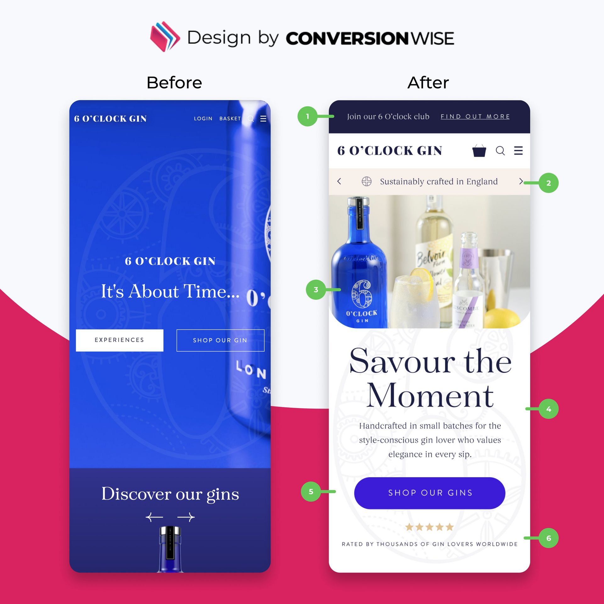
Pretty Doesn’t Always Convert — But Clarity Always Does.
Here’s what most premium brands get wrong:
They rely on beautiful visuals and clever taglines...
…but forget that clarity, trust, and emotion are what make people buy.
Here’s how we refined 6 O’Clock Gin’s homepage at ConversionWise:
1. Top Bar Engagement
→ Added a “Join our 6 O’Clock Club” banner
→ Encourages loyalty and captures high-intent visitors instantly
2. Quality Cue Above the Fold
→ “Sustainably crafted in England” — a trust signal and brand differentiator right where it matters
3. Hero Image Refresh
→ Replaced abstract background with a product-in-use visual
→ Adds context, emotion, and aspiration
4. Emotion-Led Headline & Copy
→ From “It’s About Time” to “Savour the Moment”
→ Speaks directly to the customer’s desired feeling — not just the brand
5. Stronger CTA
→ Simplified to one focused call-to-action: “Shop Our Gins”
→ Clear, central, and easy to act on
6. Social Proof Placement
→ Added visible 5-star rating and “Loved by thousands” statement
→ Reinforces trust and quality without overexplaining
The Lesson:
Design draws attention.
Clarity converts it.
Your homepage shouldn’t just look premium, it should make customers feel confident hitting buy.
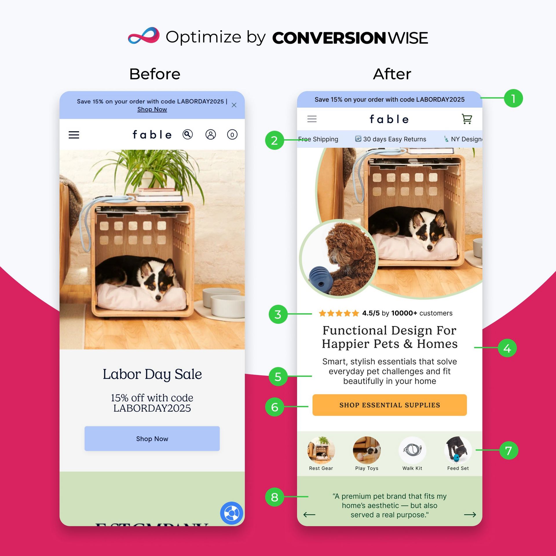
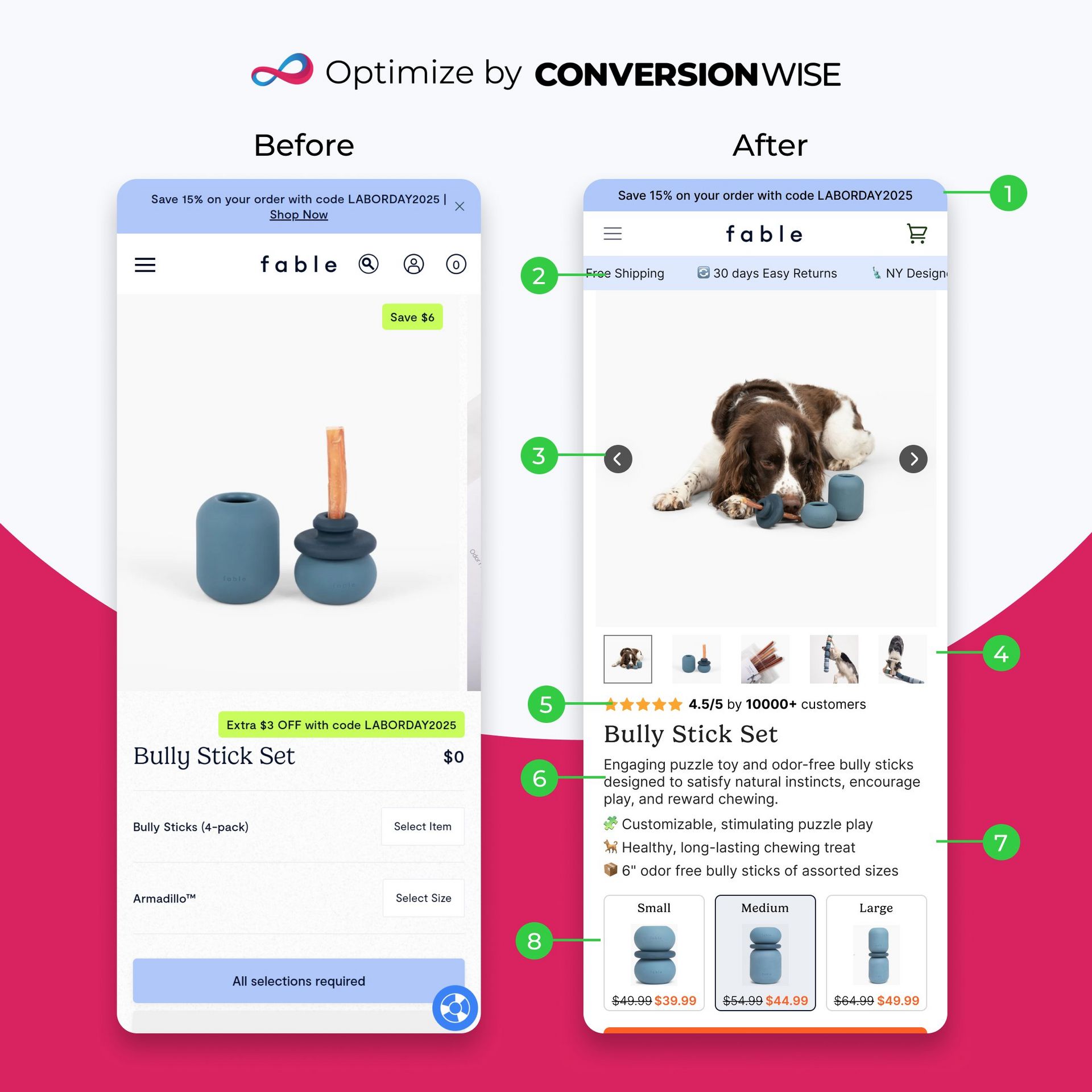
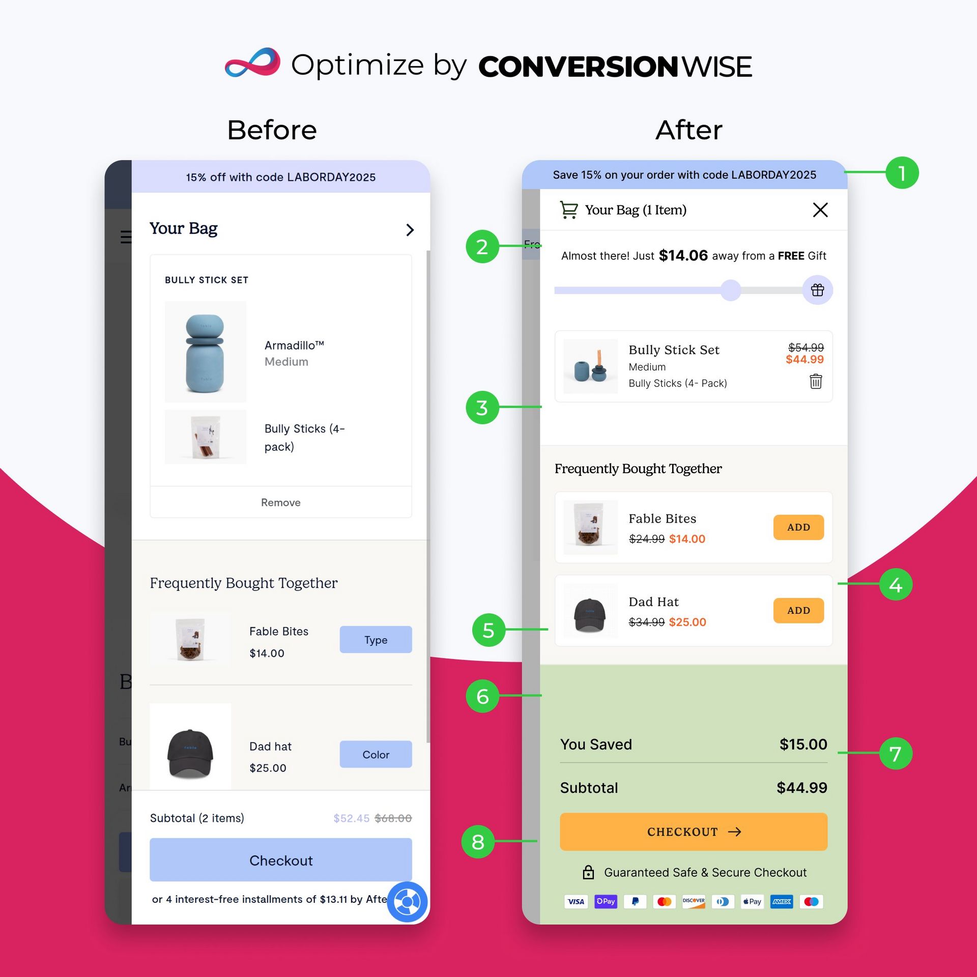
CRO Insight
Fable’s store looks great but it’s missing key conversion signals 👇
Here’s how I’d optimize their experience after 12+ years improving 4000+ ecommerce brands:
1/ Homepage Above-The-Fold
→ Added trust bar (free shipping, easy returns, NY design)
→ Highlighted review count (10,000+ customers) for credibility
→ Stronger headline: “Functional Design For Happier Pets & Homes”
→ Clear benefit-driven subheading showcasing everyday value
→ Contrasting CTA: “Shop Essential Supplies”
→ Scroll cue linking to key product categories
→ Added testimonial for instant social proof
2/ Product Page Enhancements
→ Introduced trust bar at the top for reassurance
→ Larger, lifestyle-focused hero imagery
→ Added social proof (rating + review count)
→ Clear benefit-led bullet points
→ Improved pricing hierarchy with strike-throughs
→ Added clear sizing/variant section
→ Strengthened overall visual hierarchy and CTA contrast
3/ Cart Page Transformation
→ Added value bar showing progress to free gift
→ Simplified product details for clarity
→ Introduced dynamic cross-sells with “Add” buttons
→ Highlighted total savings clearly
→ Added trust signals and payment logos under CTA
→ Full-width, high-contrast checkout button
While these are educated CRO improvements, real growth comes from A/B testing each hypothesis.
Even so, changes like these alone could lift conversions significantly.
Want a similar transformation for your brand? You can get one for 60% off. Check out more details here.
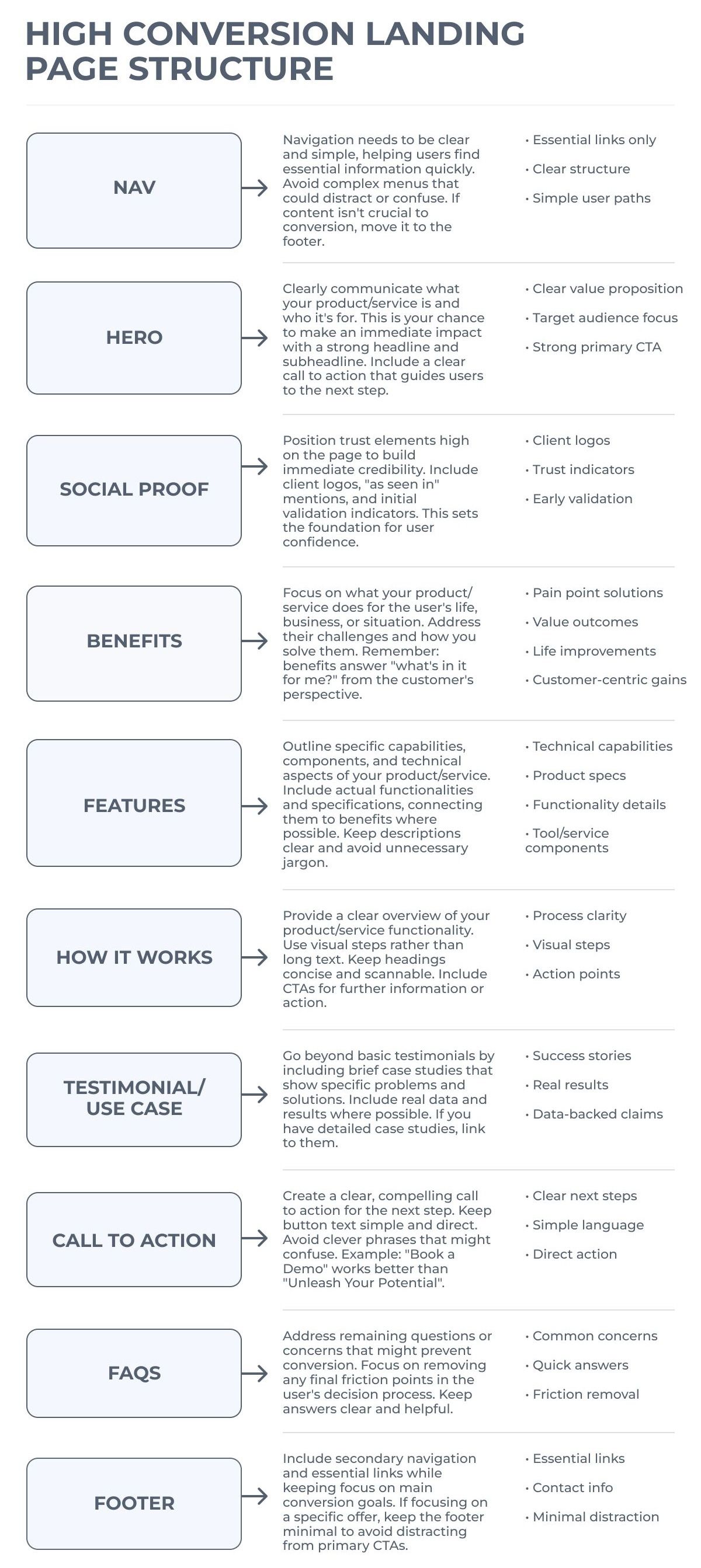
If Your Landing Page Feels Messy, You Don’t Need More Design Trends, You Need Structure
This proven, section-by-section layout turns visitors into buyers 👇
🚀 Want to Reach 40,465+ E-commerce Store Owners?
ConversionMail connects your brand with a highly engaged audience of store owners, marketers, and optimization specialists who are actively looking for solutions to boost their bottom line.
From CRO platforms and analytics tools to email solutions and checkout optimizers, if your product helps online stores make more money, our audience wants to know about it.
What do you want to learn next Wednesday?Vote below and your wish will come true: |
What did you think of this week's issue?We take your feedback seriously. |